04
Mama Bakery
Client
Client
Mama Bakery
Mama Bakery
Type
Type
Brand Identity
Brand Identity
,
,
Packaging
Packaging
Year
Year
2025
2025
About
About
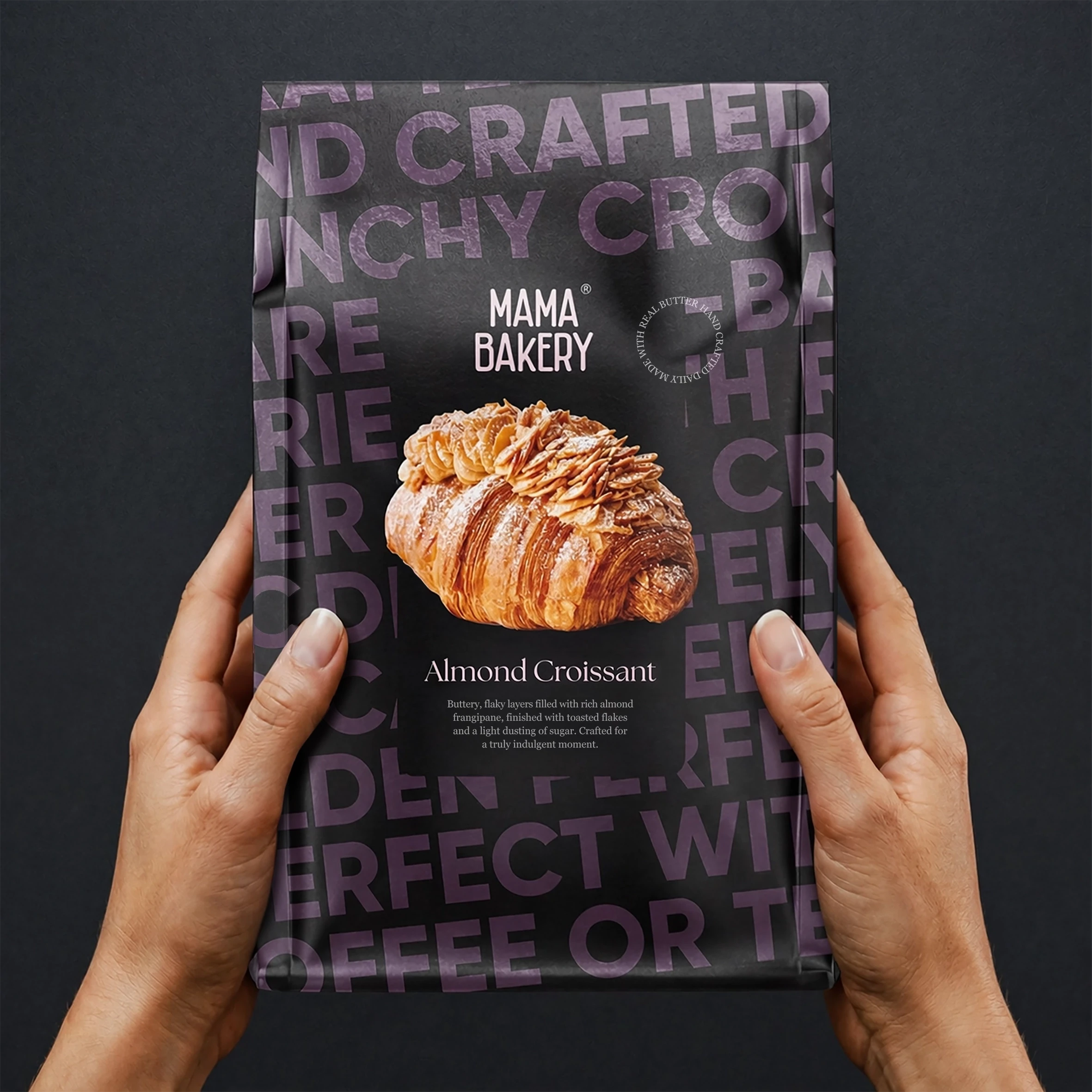
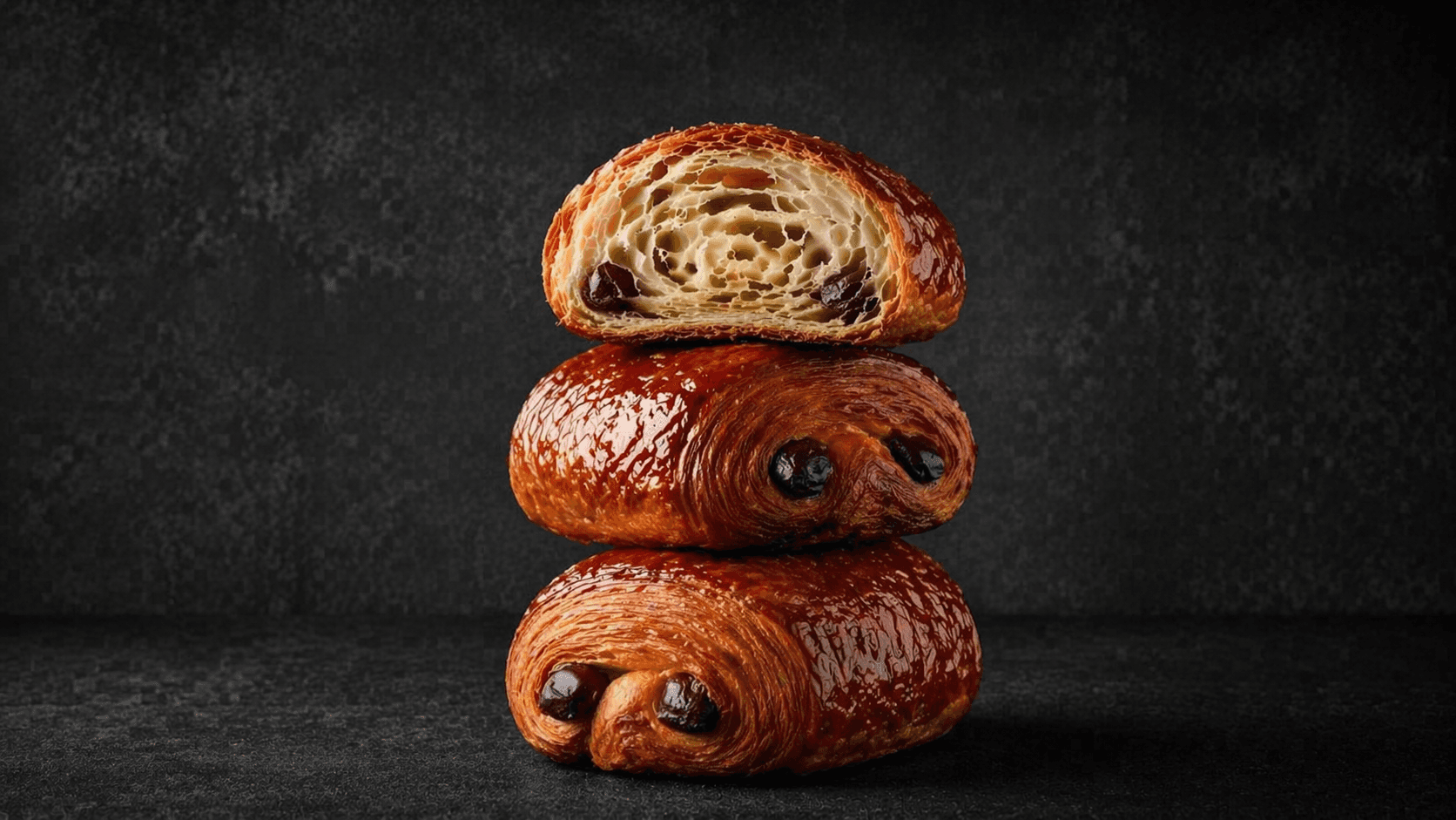
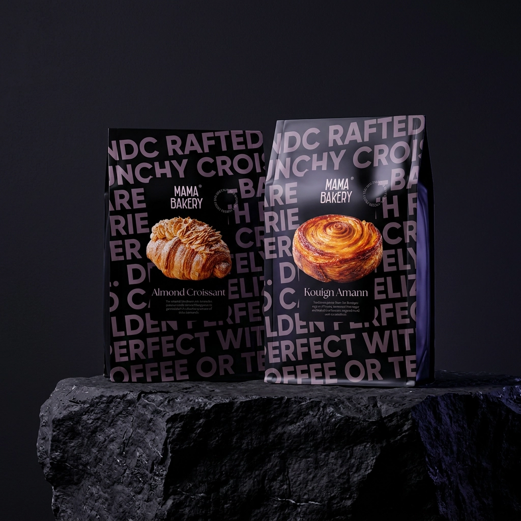
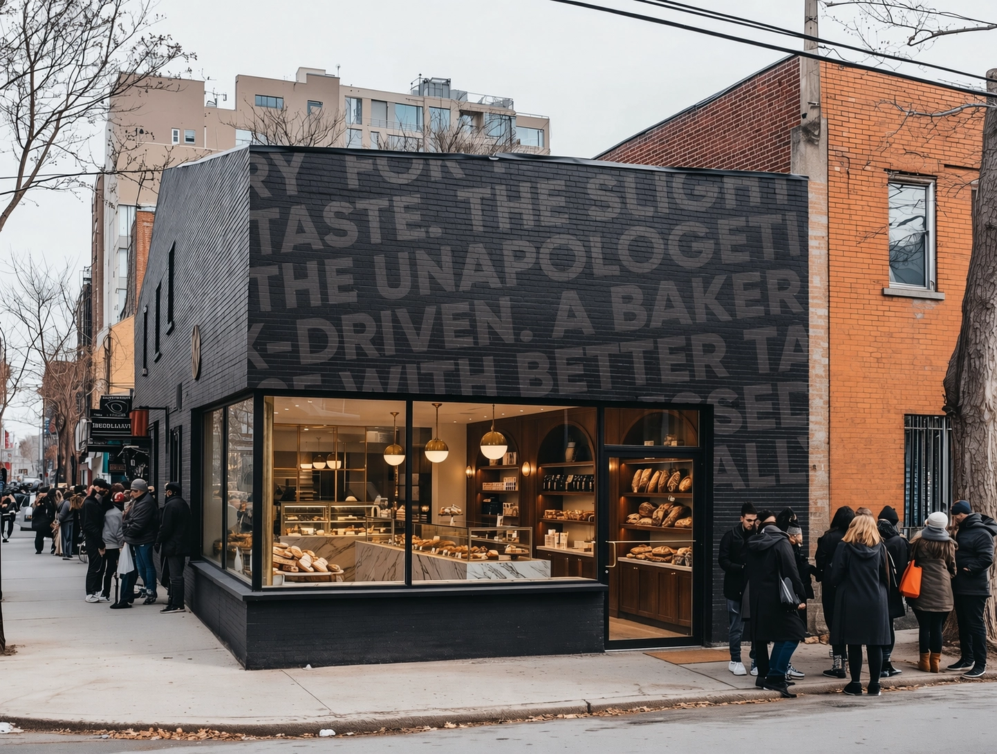
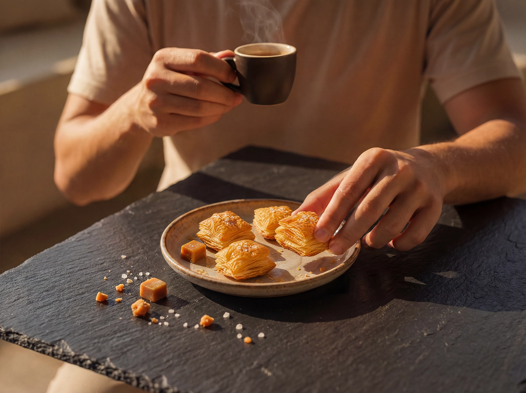
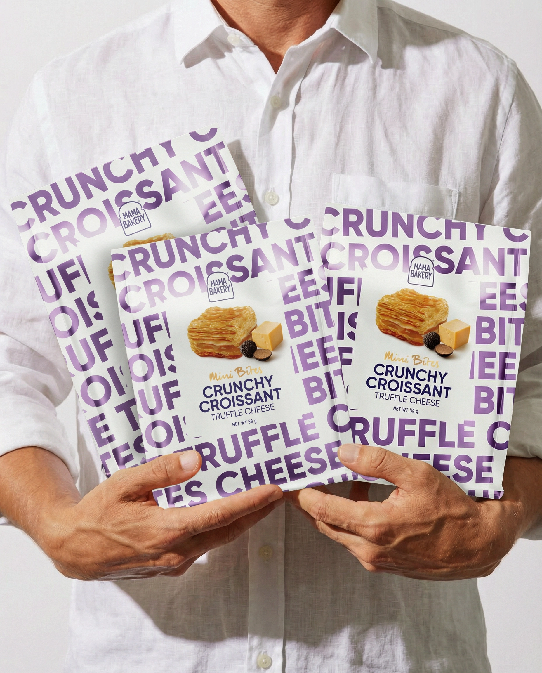
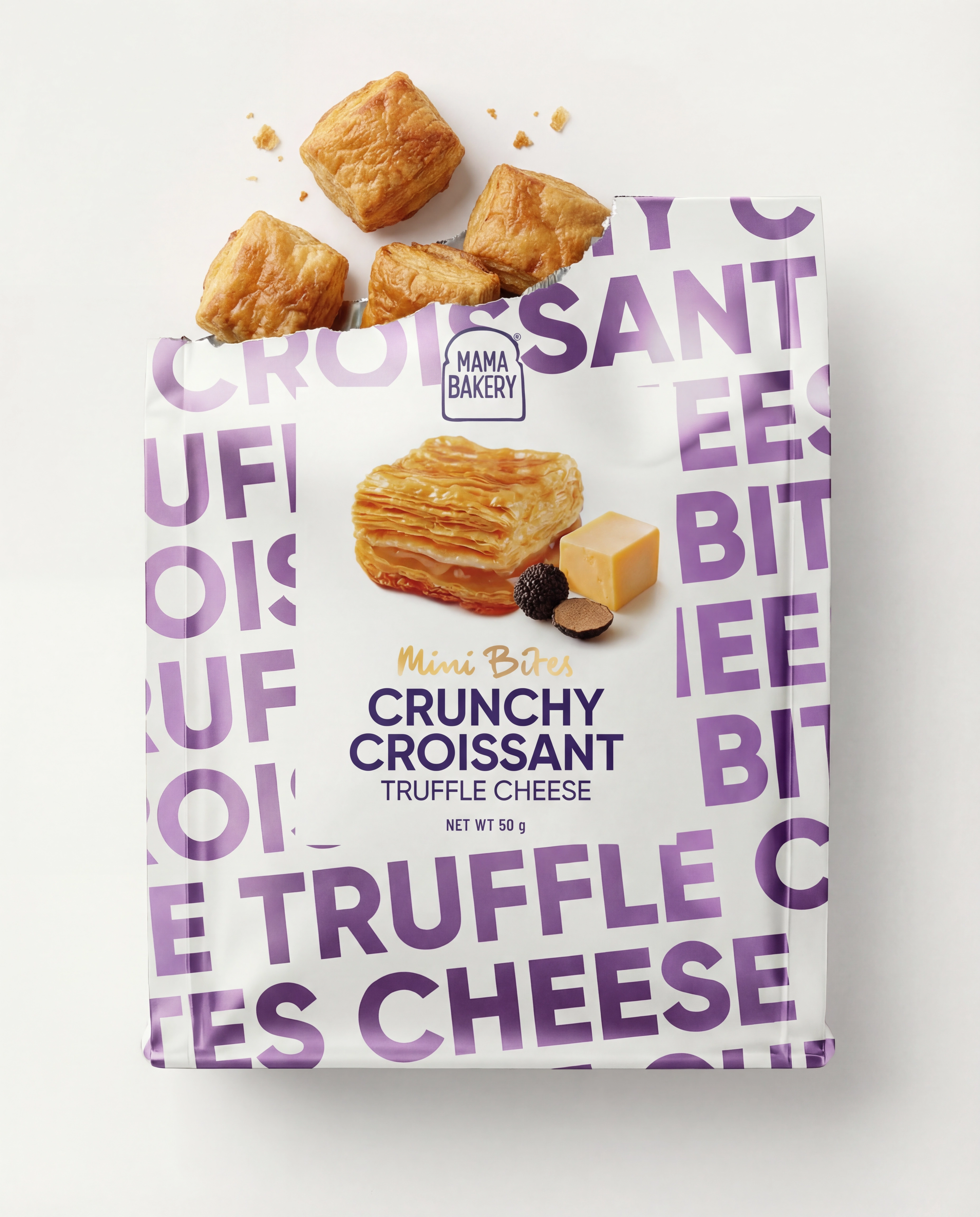
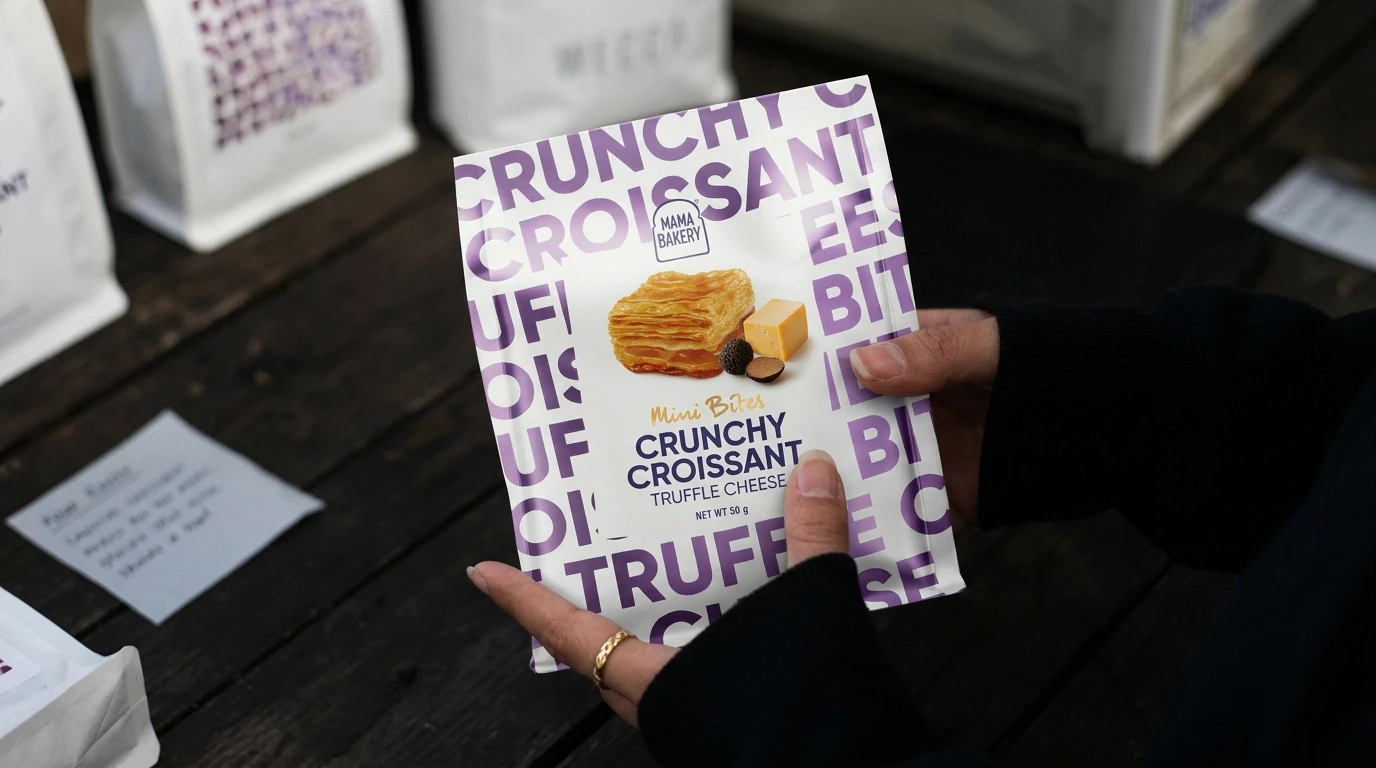
A Hong Kong boutique bakery was moving into packaged snacks and wanted every pack to feel genuinely luxurious: artisan-craft luxurious, not just premium-priced. We built the system around one typographic idea: the product name, repeated and oversized, running edge to edge. On the premium bakery packs it sits in deep tones with matte and foil finishes. On the Crunchy Croissant Mini Bites range it flips to white, with each flavour, from Truffle Cheese to Salted Caramel, owning its colour. The same pattern carries onto the store front, so the brand is recognisable before anyone reads a word. One idea, applied with discipline, became the brand.
A Hong Kong boutique bakery was moving into packaged snacks and wanted every pack to feel genuinely luxurious: artisan-craft luxurious, not just premium-priced. We built the system around one typographic idea: the product name, repeated and oversized, running edge to edge. On the premium bakery packs it sits in deep tones with matte and foil finishes. On the Crunchy Croissant Mini Bites range it flips to white, with each flavour, from Truffle Cheese to Salted Caramel, owning its colour. The same pattern carries onto the store front, so the brand is recognisable before anyone reads a word. One idea, applied with discipline, became the brand.
Quote
The packaging became the brand. Before anyone opens the box, they already understand what Mama Bakery is
Pedro Merida
Credits
Pedro Merida
Creative Director
Sabina van Koert
Creative Director
Quote
The packaging became the brand. Before anyone opens the box, they already understand what Mama Bakery is
Pedro Merida